

Visualizing the Physical Relationships Between Artifacts and Infrastructure Nodes (e.g., AWS EC2, Lambda, DynamoDB)
Component Diagrams (from the previous section) define what is being deployed—the modular, executable software units and their contracts. Deployment Diagrams answer where and how those units are actually placed and connected in the physical (or virtual) runtime environment. They bridge architecture and operations by showing:
- Artifacts — concrete deployable items (Docker images, JAR/WAR files, executables, configuration files, serverless function code, Helm charts, etc.)
- Nodes — physical or virtual execution environments (servers, virtual machines, containers, Kubernetes pods, AWS EC2 instances, Lambda functions, Fargate tasks, databases, load balancers, message queues)
- Deployment relationships — which artifacts run on which nodes
- Communication paths — network links between nodes (HTTP/HTTPS, TCP, gRPC, message queues, VPC peering)
- Hardware/software stereotypes — <<device>>, <<executionEnvironment>>, <<cloud>>, <<container>>, <<serverless>>, etc.
- Scaling & replication — multiplicity notations (e.g., 3..5 replicas) or cloud-specific annotations
In cloud-native, hybrid, or distributed systems, Deployment Diagrams have become essential for visualizing topology, identifying single points of failure, planning high availability, estimating costs, supporting security reviews, and aligning with infrastructure-as-code (IaC) definitions (Terraform, CloudFormation, Pulumi, Helm).
Visual Paradigm’s AI makes these diagrams fast to create and easy to evolve. You describe your target runtime environment in natural language—often referencing AWS, Azure, GCP, Kubernetes, or on-prem—and the AI generates a clean, icon-rich, standards-compliant Deployment Diagram in seconds.
How to Create Deployment Mappings with AI
-
Describe the Runtime Topology In the AI Chatbot (or via the Deployment Diagram Generator in the Innovation Hub), provide a clear description:
- “Generate a Deployment Diagram for the e-commerce system on AWS. Show:
- React SPA hosted on S3 + CloudFront
- API Gateway routing to
- Order Service (ECS Fargate container)
- Product Catalog Service (EKS pod)
- Payment Service (Lambda function)
- PostgreSQL on RDS (primary + read replica)
- Redis ElastiCache
- S3 bucket for product images Include communication paths (HTTPS, VPC-internal) and show load balancer in front of ECS.”
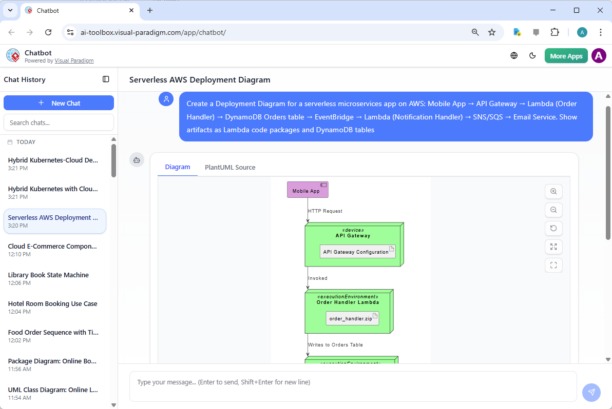
- “Create a Deployment Diagram for a serverless microservices app on AWS: Mobile App → API Gateway → Lambda (Order Handler) → DynamoDB Orders table → EventBridge → Lambda (Notification Handler) → SNS/SQS → Email Service. Show artifacts as Lambda code packages and DynamoDB tables.”
- “Model a hybrid deployment: On-prem Kubernetes cluster running core services (Order, Inventory) Cloud bursting to AWS EC2 Auto Scaling Group for peak load Shared PostgreSQL on RDS Kafka cluster on-prem → AWS MSK for cross-environment events.”
- “Generate a Deployment Diagram for the e-commerce system on AWS. Show:
-
AI Generates a Professional Deployment Diagram The output includes:
- 3D cube nodes for devices/servers, cloud icons for AWS/Azure/GCP services
- Artifact manifests (files/folders inside nodes) with <<artifact>> stereotype
- Deployment arrows (solid line with open triangle) showing which artifact runs on which node
- Communication paths (dashed or solid lines) labeled with protocols (<<HTTPS>>, <<JMS>>, <<gRPC>>)
- Stereotypes & icons specific to cloud providers (EC2, Lambda, DynamoDB, RDS, EKS, S3, etc.)
- Clean, layered layout (often client → edge → application → data tiers)
-
Iterative Refinement via Natural Language Evolve the topology conversationally:
- “Add an Application Load Balancer in front of the ECS services and show HTTPS termination.”
- “Introduce high availability: duplicate RDS with multi-AZ deployment and show read replicas.”
- “Change Payment Service from Lambda to ECS Fargate for longer-running transactions.”
- “Add a Redis ElastiCache cluster with 2 nodes and show connection from Order Service.”
- “Show event-driven flow: Order Service publishes to SNS topic → subscribed by Notification Lambda.”
- “Highlight security: add VPC boundary and security group icons.”
- “Switch layout to vertical tiers (client, edge, compute, data) and use AWS color scheme.”
Diagram Touch-Up automatically reroutes paths, repositions nodes, adjusts spacing, and maintains clarity—no manual dragging required.
Why Deployment Diagrams Are Critical in Cloud Environments
| Challenge Without Deployment Mapping | AI-Generated Diagram Advantage |
|---|---|
| Topology unclear until IaC is written | Early visual of runtime layout before coding IaC |
| Hidden single points of failure | Quickly spot missing replicas, zones, or load balancers |
| Communication paths undocumented | Explicit protocol/latency/security annotations |
| Scaling & resilience hard to communicate | Multiplicity, AZs, auto-scaling groups visualized |
| Cloud cost & sizing discussions abstract | Concrete nodes + artifacts → easier estimation |
| DevOps handoff lacks shared picture | Single diagram aligns architects, developers, and ops |
Practical Tips for Cloud-Native Deployment Modeling
- Use provider-specific stereotypes/icons: <<AWS_EC2>>, <<AWS_Lambda>>, <<AWS_DynamoDB>>, <<Kubernetes_Pod>>
- Label paths meaningfully: <<HTTPS:443>>, <<Amazon SQS>>, <<VPC peering>>
- Include external services: <<SaaS>> Stripe, <<CDN>> CloudFront
- Combine with Component Diagrams: artifacts in components map to deployed instances here
- Ask for alternatives: “Show blue-green deployment variant” or “Compare serverless vs. containerized topology”
Real-World Payoff
- Production Readiness Reviews — “Here’s how we’ll deploy—any missing HA or security concerns?”
- Cost & Scaling Discussions — Visualize EC2 vs. Fargate vs. Lambda trade-offs
- Incident Response — Diagram shows exactly where a failure (e.g., DynamoDB hotspot) would manifest
- Onboarding & Audits — New team members instantly see the runtime landscape
Deployment Diagrams bring the entire model into the physical world—showing how abstract components become running services on real (or cloud) infrastructure. With AI handling cloud icons, node stereotypes, path labeling, and layout intelligence, you can explore, validate, and communicate deployment strategies rapidly.
This completes the core infrastructure modeling in Module 6. The next sections extend into specialized Timing Diagrams for real-time systems and advanced architectural frameworks—ensuring your models cover both functional depth and operational reality.