


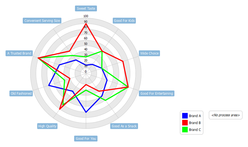
What is a Radar Chart?
A radar chart is a graphical representation of data that is used to display performance or comparison of multiple variables on a two-dimensional plane. Also known as a spider chart, web chart, or star chart, a radar chart consists of a series of spokes that radiate outward from a central point. Each spoke represents one of the variables being measured, and the length of the spoke indicates the value of the variable.
The data for each variable is plotted on the chart as a series of points, which are then connected by a line to form a closed polygon. The resulting shape shows the relative performance or comparison of each variable, with larger polygons indicating better performance or higher values.
Radar charts are commonly used in fields such as marketing, business, and sports to compare the performance of multiple products, services, or players across different dimensions, such as quality, price, and features. They can be a useful tool for visualizing complex data and identifying patterns or trends.
Using Radar Chart Analysis to Improve Customer Experience
Radar chart analysis can be a useful tool for customer experience improvement because it allows businesses to compare and visualize how their customer experience performance measures up against competitors and industry standards across multiple dimensions.
For example, a business can use a radar chart to evaluate its customer experience across dimensions such as response time, issue resolution, ease of use, and customer satisfaction. By identifying areas where their performance is lacking compared to competitors, they can develop action plans to improve their customer experience in those specific areas.
In addition, radar charts can help businesses track the effectiveness of their customer experience improvement initiatives over time. By comparing their performance before and after implementing changes, they can see which initiatives have been successful and which areas still need improvement.
Overall, radar chart analysis can be a valuable tool in improving customer experience by providing businesses with a visual representation of their performance and identifying areas for improvement.
Now, let’s begin with an example scenario
Problem Scenario:
A company, XYZ Inc., is planning to launch a new product in the market and wants to compare its product with its competitors in terms of features, quality, and pricing. The company wants to identify its strengths and weaknesses compared to its competitors and formulate a marketing strategy accordingly.
To achieve this, the company can use a radar chart analysis to compare its product against its competitors. However, the company is facing some challenges in conducting the analysis. Firstly, the company is unsure about which specific features to include in the radar chart and how to weight them appropriately. Secondly, the company has limited information on its competitors’ products, making it difficult to compare them accurately.
Furthermore, the company is facing a time constraint as it needs to launch the product soon. Therefore, the company needs to conduct the analysis quickly and efficiently. To solve these challenges, the company needs to gather more information on its competitors’ products and conduct a thorough analysis to identify the critical features that matter to customers. Additionally, the company can consult with market research experts to help with the analysis and provide guidance on the appropriate weighting of the features.
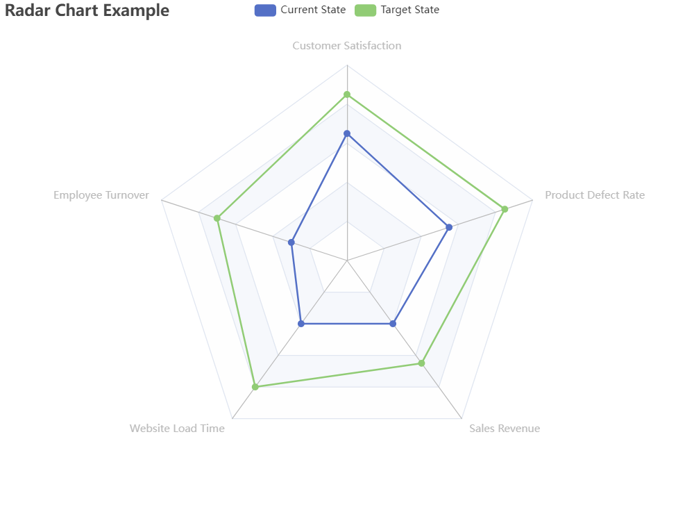
Summarize Data into a Table
Here’s an example table with criteria, current state, target state, and GAP:
| Criteria | Current State | Target State | GAP (Current State – Target State) |
|---|---|---|---|
| Customer satisfaction score | 75% | 85% | -10% |
| Employee turnover rate | 20% | 10% | 10% |
| Website load time | 5 seconds | 3 seconds | 2 seconds |
| Sales revenue | $1 million | $1.5 million | -$500,000 |
| Product defect rate | 2% | 1% | 1% |
Note: This is just an example table, and the criteria, current state, target state, and GAP will vary depending on the specific context and goals of the analysis.
Unified Values in the Scale 1-10 for the Radar Chart Visualization
To address the issue of different scales or units of measurement, we use a standardized or relative scale. This involves setting a benchmark or reference point for each dimension, and then calculating the performance of each entity relative to that benchmark.
For example, you could choose a competitor with the highest score in a particular dimension as the benchmark, and then calculate the performance of other competitors relative to that benchmark. This can help to highlight relative strengths and weaknesses across different dimensions and enable easier comparison between entities.
Another option is to use a percentile ranking, where each entity’s performance is ranked against a reference group and expressed as a percentage. This can help to provide a more standardized and meaningful measure of performance across different dimensions and entities.
Ultimately, the choice of approach will depend on the specific context and objectives of the analysis, as well as the availability and quality of data. It is important to carefully consider the strengths and limitations of each approach and choose the one that is most appropriate for the situation.
Here’s an example table that normalizes the values in the original table to a scale of 1-10:
| Criteria | Current State | Target State | Normalized Current State | Normalized Target State |
|---|---|---|---|---|
| Customer satisfaction score | 75% | 85% | 6.5 | 8.5 |
| Employee turnover rate | 20% | 10% | 3.0 | 7.0 |
| Website load time | 5 seconds | 3 seconds | 4.0 | 8.0 |
| Sales revenue | $1 million | $1.5 million | 4.0 | 6.5 |
| Product defect rate | 2% | 1% | 5.5 | 8.5 |
Note: This is just an example table, and the specific method of normalization and resulting values will depend on the specific context and goals of the analysis. Additionally, it’s important to note that the normalization process can introduce its own biases and assumptions, so it’s important to carefully consider the tradeoffs of using this approach.
Create the Radar Chart
The chart consists of a central point from which multiple lines extend to represent each variable. The area within the lines is then shaded or colored to indicate the level of performance achieved for each variable. By visualizing the performance of multiple variables on a single chart, businesses can quickly identify areas of strength and weakness and develop strategies to improve performance where needed.
Identify the Action to be Taken for the Improvement
Adding a column of “Action to be Taken” to the table above would provide a clear plan for addressing the gaps between the current state and the target state. It would help to ensure that the insights gained from the analysis are translated into actionable steps that can be taken to improve performance.
For example, in the case of the “Customer Satisfaction” criterion, if the current state is a 6.5 and the target state is 8.5, the “Action to be Taken” column might include specific steps such as implementing a customer feedback survey, improving customer service training for staff, or offering discounts or rewards for customer loyalty.
Here is the table with an additional column of “Action to be Taken”:
| Criteria | Current State | Target State | GAP (Current State – Target State) | Action to be Taken |
|---|---|---|---|---|
| Customer Satisfaction | 6.5 | 8.5 | -2.0 | Implement a customer feedback survey; improve customer service training; offer discounts or rewards for customer loyalty |
| Employee Turnover | 3.0 | 7.0 | -4.0 | Improve employee benefits; offer more professional development opportunities; increase salaries or bonuses |
| Website Load Time | 4.0 | 8.0 | -4.0 | Optimize website code; improve server performance; use a content delivery network |
| Sales Revenue | 4.0 | 6.5 | -2.5 | Increase marketing efforts; expand product offerings; improve customer service |
| Product Defect Rate | 5.5 | 8.5 | -3.0 | Improve quality control processes; implement more rigorous testing protocols; increase training for production staff |
Identify Teams for the Implementation of Actions
Creating a column to associate stakeholders involved in the table would provide clarity on who will be responsible for implementing the identified actions. It ensures that each action item has a designated owner or team responsible for its implementation. It also facilitates communication and collaboration between team members, as each person involved knows their responsibilities and who they can reach out to for support or guidance.
For example, in the table provided, if the “Action to be Taken” for improving employee turnover includes improving employee benefits, offering more professional development opportunities, and increasing salaries or bonuses, a stakeholder column could be added to indicate who will be responsible for implementing each of these actions. This could include the HR department for improving employee benefits, the training department for offering professional development opportunities, and the finance department for increasing salaries or bonuses.
By associating stakeholders with each action item, it ensures that everyone involved is aware of their responsibilities and the actions required to achieve the desired target state. It also helps to ensure that there is accountability and ownership for each action item, which can ultimately lead to more effective and efficient implementation.
Here is the updated table with an additional column for stakeholders involved:
| Criteria | Current State | Target State | GAP (Current State – Target State) | Action to be Taken | Stakeholders Involved |
|---|---|---|---|---|---|
| Customer Satisfaction | 6.5 | 8.5 | -2.0 | Implement a customer feedback survey; improve customer service training; offer discounts or rewards for customer loyalty | Customer Service, Marketing, Sales |
| Employee Turnover | 3.0 | 7.0 | -4.0 | Improve employee benefits; offer more professional development opportunities; increase salaries or bonuses | HR, Finance, Training |
| Website Load Time | 4.0 | 8.0 | -4.0 | Optimize website code; improve server performance; use a content delivery network | IT, Web Development, Marketing |
| Sales Revenue | 4.0 | 6.5 | -2.5 | Increase marketing efforts; expand product offerings; improve customer service | Marketing, Sales, Customer Service |
| Product Defect Rate | 5.5 | 8.5 | -3.0 | Improve quality control processes; implement more rigorous testing protocols; increase training for production staff | Production, Quality Control, Training, Testing |
Drill Down for the Details
In this example, we have broken down the overall action of improving customer satisfaction into four specific action items. For each action item, we have identified the responsible party or parties who will be accountable for implementing it, the timeline for completion, and the resources required.
Here’s an example of how we can refine the “Customer Satisfaction” criteria into an implementation plan in table form:
| Action Item | Responsible Party | Timeline | Resources Required |
|---|---|---|---|
| Develop and distribute customer feedback survey | Marketing and Customer Service | Next 2 weeks | Survey software, personnel |
| Analyze customer feedback and identify areas for improvement | Marketing and Customer Service | Week 3 – Week 4 | Data analysis software, personnel |
| Develop and implement improved customer service training program | Training and Customer Service | Month 2 – Month 3 | Training materials, personnel |
| Offer discounts or rewards for customer loyalty | Marketing and Sales | Month 4 – ongoing | Budget allocation |
- The first action item is to develop and distribute a customer feedback survey, which will be the responsibility of the Marketing and Customer Service teams. The timeline for completion is within the next two weeks, and the resources required are survey software and personnel to design and distribute the survey.
- The second action item is to analyze the customer feedback collected from the survey and identify areas for improvement. This task will also be the responsibility of the Marketing and Customer Service teams and is expected to be completed in weeks 3-4. The resources required are data analysis software and personnel to review the feedback.
- The third action item is to develop and implement an improved customer service training program, which will be the responsibility of the Training and Customer Service teams. The timeline for completion is within months 2-3, and the resources required are training materials and personnel to develop and deliver the program.
- The final action item is to offer discounts or rewards for customer loyalty, which will be the responsibility of the Marketing and Sales teams. The timeline for this action item is ongoing, and the resources required are budget allocation for the discounts or rewards.
Overall, this implementation plan provides a clear roadmap for improving customer satisfaction by breaking down the overall goal into specific, actionable tasks with clear accountability and timelines.
Define the Role and Responsibilities for the Team
Here’s an example of how we can expand the “Responsible Party” column in the implementation plan table to include the additional columns of Role, Responsibilities, and Required Skills:
| Action Item | Role | Responsibilities | Required Skills | Timeline | Resources Required |
|---|---|---|---|---|---|
| Develop and distribute customer feedback survey | Marketing and Customer Service | Design and distribute survey to customers | Data analysis, customer service skills, marketing skills, survey design skills | Next 2 weeks | Survey software, personnel |
| Analyze customer feedback and identify areas for improvement | Marketing and Customer Service | Analyze customer feedback data and identify areas for improvement | Data analysis, problem-solving skills, communication skills | Week 3 – Week 4 | Data analysis software, personnel |
| Develop and implement improved customer service training program | Training and Customer Service | Develop and deliver improved customer service training program | Training and coaching skills, customer service skills, communication skills, presentation skills | Month 2 – Month 3 | Training materials, personnel |
| Offer discounts or rewards for customer loyalty | Marketing and Sales | Develop and execute customer loyalty program | Marketing skills, budgeting skills, customer service skills, negotiation skills, data analysis skills | Month 4 – ongoing | Budget allocation |
In this example, we have added three additional columns: Role, Responsibilities, and Required Skills.
- For the first action item, “Develop and distribute customer feedback survey,” the Marketing and Customer Service teams will be responsible for designing and distributing the survey to customers. The required skills for this role include data analysis, customer service skills, marketing skills, and survey design skills.
- For the second action item, “Analyze customer feedback and identify areas for improvement,” the Marketing and Customer Service teams will be responsible for analyzing the customer feedback data and identifying areas for improvement. The required skills for this role include data analysis, problem-solving skills, and communication skills.
- For the third action item, “Develop and implement improved customer service training program,” the Training and Customer Service teams will be responsible for developing and delivering the improved customer service training program. The required skills for this role include training and coaching skills, customer service skills, communication skills, and presentation skills.
- For the final action item, “Offer discounts or rewards for customer loyalty,” the Marketing and Sales teams will be responsible for developing and executing the customer loyalty program. The required skills for this role include marketing skills, budgeting skills, customer service skills, negotiation skills, and data analysis skills.
By adding these additional columns to the implementation plan table, we can more clearly define the roles, responsibilities, and required skills for each action item, which can help ensure that the right people are assigned to each task and that they have the necessary skills to complete it successfully.
Summary
This article provides a comprehensive guide to improving customer experience through the use of radar chart analysis. It begins by defining what a radar chart is and how it can be used to compare and visualize performance across multiple dimensions. The article then explores how radar chart analysis is related to customer experience improvement and the benefits it offers to businesses.
The article also covers the importance of normalizing data and adding relevant columns to enhance the effectiveness of radar chart analysis. It offers an example scenario of how radar chart analysis can be applied to identify customer experience issues, develop an action plan, and track progress over time.
Finally, the article concludes by emphasizing the significance of continuously monitoring and evaluating customer experience to stay competitive in today’s market. Overall, the article provides valuable insights and practical advice for businesses seeking to improve their customer experience through the use of radar chart analysis.